Port-
folio
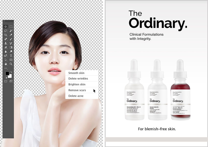
The Ordinary campaign 2-page magazine spread


This 2-page spread magazine ad is designed to have a minimalistic, monochrome colour scheme to emphasize a clean, sophisticated feel. The main visual is focused on the left page with a Photoshop like background and the toolbar used to edit images along with a model with visibly clear skin. An option box with the options to smooth skin, delete wrinkles, brighten scars, remove scars and delete acne is present on the model's skin, implicating that it is possible to achieve all of the options with The Ordinary products just like it is with photoshop.
On the right side of the page, the brand name, tagline and the products are displayed clearly, along with the brand promise, 'For blemish-free skin'. This is to arouse potential consumers to purchase the specific products that are formulated to target blemished skin.
The Ordinary campaign tri-fold brochure


Designed as a 3-panel brochure that is to be folded, this brochure is designed to have aesthetic appeal as well as provide ample information on the products. When opened, audiences will be able to see the Niacinamide product on the left and the brandís logo with the tagline on the right flap of the brochure. When fully opened, the inside of the brochure displays three different products and their functions in detail. The content contains what the ingredient is and what effects it has to skin, as well is when and when not to use it.
The main purpose of the brochure is to educate people on the ingredients and what they actually do to help your skin, so people would be familiar with the product names which are named after the scientific names of the ingredients. The overall design of the brochure has a clean, minimal look.
The Ordinary campaign website page 1


The design of the landing page is minimalistic with a hint of colour, following the same concept throughout the whole campaign. The main focus of the page is a slideshow of all the brand's bestseller products that brings the viewer to the product information page if they were to click on the image. This is a good way to introduce products to newcomers that do not know much about the brand's products.
The brand logo is at the top middle of the page along with its signature grey strip. The top left of the page displays icons of the brand's social media accounts that links viewers to the respective pages. There are four tabs and a search icon where viewers can search for the specific products that they want. All of these are locked across all pages of the website.
The Ordinary campaign website page 2


The second page of the website is the 'About' page where it displays what The Ordinary is as a company and what they do. The colour scheme uses pastel colours to match the theme and I made use of shapes and lines to make the page look more artistic, but still minimalistic.
The Ordinary campaign website page 3


The third page is the product page and it consists of the different categories of products that The Ordinary offer. Following the same colour scheme of pastel colours, this page is to help viewers find the products that they are interested in rather than going through a list of products that they are not interested in.
The Ordinary campaign website page 4


The forth page is what viewers would see if they click on one of the options in the previous page. In this particular page, this is what a viewer would see if they were to click on the ëAntioxidantsí page. The page contains ample information on the single product which would prove useful for the viewer to make the purchase decision.
The Ordinary campaign website page 5


The fifth page is the regimen guide page where viewers can obtain even more information on the product about how, when and when not to use it. With helpful indicators on the bottom right, this page can help viewers build their skincare regimen with ease.